
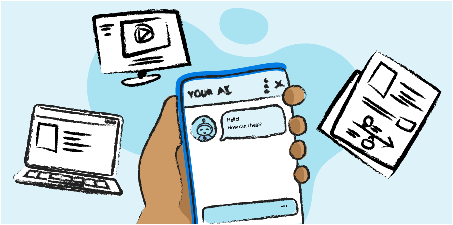
Today’s patients primarily engage with brands through online and digital resources. Although print still plays a role, especially in older and less tech-literate patient populations, marketing materials must be optimized for digital channels in order to effectively reach patients.
A UX design lens helps us create digital materials that are as intuitive and accessible as possible. This can make a big difference, especially in advanced therapies for rare and complex diseases, where patients are often quite sick and faced with increasingly difficult treatment decisions.
Countless hours of co-creation time with patients, caregivers, HCPs, and subject matter experts have helped us think differently about how we can create digital brand marketing materials that work for wider populations of patients.
Strive for clean design
Strive for clean design

Brand marketing materials are notoriously overwhelming to read, and packed with a lot of information, both in terms of messaging and required legal and regulatory content. To manage this, we always look for ways to streamline and reduce unnecessary elements, such as keeping navigation simple and intuitive, using streamlined single-column layouts, and choosing a limited colour palette. Especially in a digital context where space is not as constrained as print, the readability of content can be improved by increasing margins and overall white space.
We’ve also worked closely with client regulatory teams to rethink how we can use modern web design capabilities to build more functional safety trays on brand websites. We were able to create a responsive tray element that takes up minimal screen real estate wherever possible, while still displaying detailed important safety information wherever it was needed for fair balance.
Optimize materials for mobile viewing

Instead of designing websites in a desktop layout, we like to start by designing for the constraints of mobile viewing. Often, this approach results in cleaner and more effective desktop layouts as well.
Follow web accessibility standards

Following web accessibility guidelines is critically important when trying to reach a patient audience that might be older and/or dealing with advanced and complex diseases. When patient brand marketing websites don’t meet simple accessibility standards, it is not only a missed opportunity to support patient understanding, but it also means the website is significantly less likely to appear on web browser searches, outside of paid advertising. A focus on search engine optimization (SEO) has become increasingly important as AI search tools prioritize deep and well-structured content.
The highest level of accessibility standards isn’t always feasible for the level of specialization required for, and constraints placed on, patient brand marketing websites. We strive for an overall level AA conformance, which is the standard for most web content according to the WCAG as it offers a balance between strong accessibility for most patients and the practical considerations of building and maintaining a website.
Design for a diverse audience

Especially in some disease states, many patients may not speak English as a first language, and there can be a wide variety of comfort with reading. In the past, the gold standard has been to provide translations of as many materials as possible. Now, built-in browser translators are so advanced, we focus on web accessibility standards, so whatever translation tool patients use can be applied effectively to our content.
It’s also important to design materials for patients with lower literacy levels. The standard reading level calculations are often not as useful in a healthcare context because they are based on word length/syllable count. If patients and caregivers are likely to hear medical terminology from their care teams, we deliberately avoid changing those words just to maintain a lower grade reading level.
When complex medical terms arise, we provide pop-up definitions and additional context around the word, so that patients are better equipped to understand it. In some cases, we also add audio pronunciations, so that patients and caregivers know how to say these complicated terms. In each case, the goal is to build patient confidence to participate in conversations with their healthcare teams.
Patient brand marketing materials are only effective to the extent they can reach their target patient population, which may face high levels of illness, language barriers, or any number of other challenges. We don’t want to miss an opportunity to use good UX design and accessibility principles to make resources that can be used as widely as possible.
Our other ideas worth exploring
5 tips for safely using LLMs to get medical advice
Examining issues with using LLMs to gather health information, and tips for having useful and less risky conversation with LLMs.
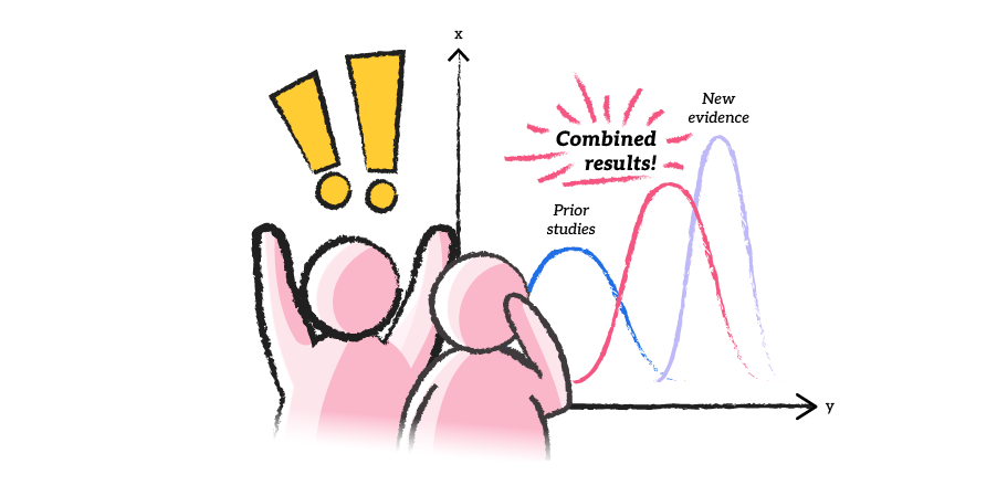
A new approach to clinical trials
A look a how Bayesian analytics could open the doors to cheaper and faster clinical trials
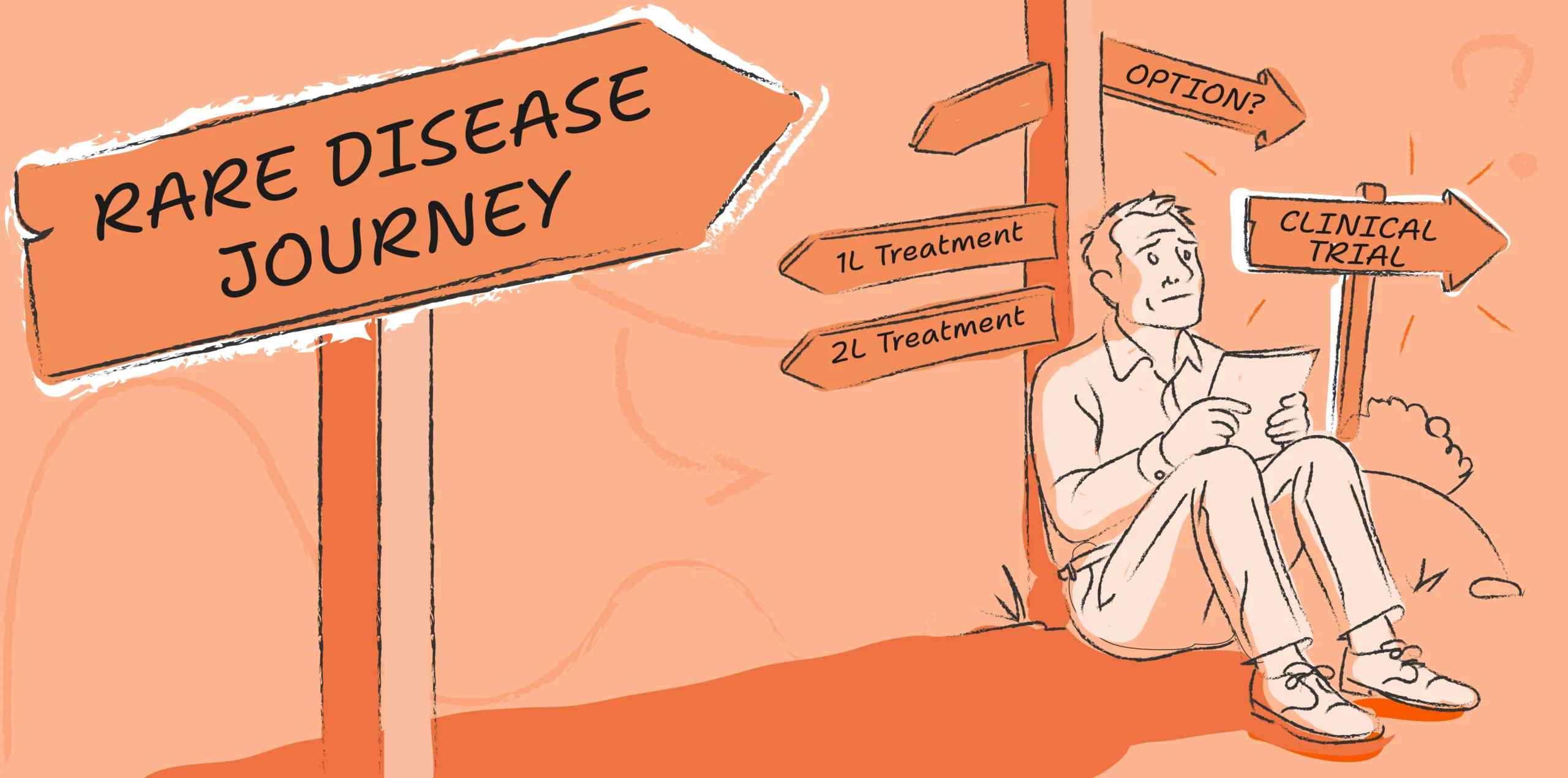
Why building awareness for rare disease clinical trials matters
A framework that can help us better measure patient experience, and allow organizations to continually learn, grow, and implement changes both small and large to improve patients’ experiences.