
We are all familiar with the way Important Safety Information (ISI) is presented in traditional patient marketing. Typically, it’s treated as an afterthought—the mandatory fair balance that must accompany promotional messaging. But ISI actually captures key information that patients with advanced and complex diseases want to know, and supports informed consent for important treatment decisions. ISI also appears over and over again in marketing materials, making it a brand touchpoint worth optimizing on.
Countless hours of co-creation time with patients, caregivers, HCPs, and subject matter experts has helped us think differently about how we can communicate ISI to patients.
Build trust by giving patients what they need

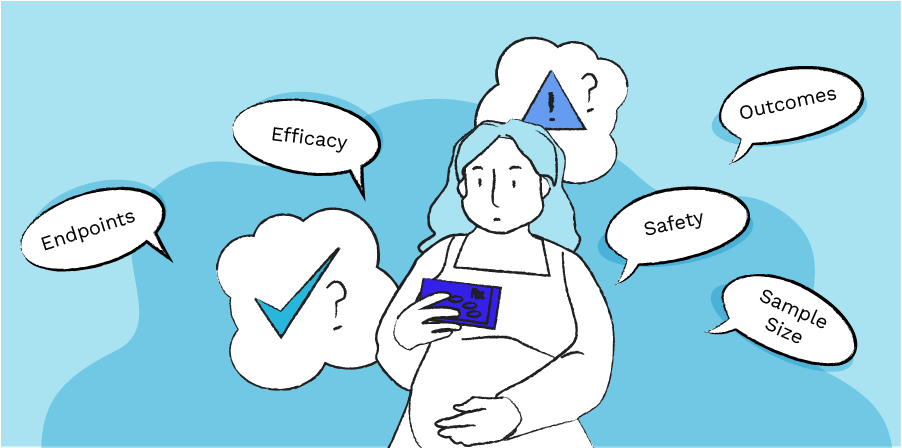
Through co-creation with patients, caregivers, and HCPs, we learned a lot about how patients with advanced and complex diseases relate to side effect information. Patients who are on their second and third lines of treatment expect difficult risk/benefit tradeoffs, and unfortunately they often don’t have many remaining treatment options. They really want to see the safety information, as clearly and comprehensively as possible.
When we make ISI more visible for these patients, and make it more robust by adding information such as side effect frequency data from clinical trials, we can build patient trust and comfort with a treatment. It’s also true that many advanced therapies can carry a stigma of being too “cutting edge” and under-tested, making this aspect of trust-building critically important to treatment decision-making.
Collaboration is key

ISI is important legal/regulatory content, and traditional approaches for including it in patient brand marketing materials tend to be well established. By participating in co-creation sessions, our brand marketing clients are able to see how patients value safety information relative to promotional messaging, and how safety information can contextualize and make patients more receptive to efficacy statements. In this way, they become champions for the redesign effort.
We also collaborate closely and continuously with our client’s medical, legal, and regulatory review teams to make sure we were finding the right balance of optimizing ISI content for patients while still following all mandatory rules and regulations. Their involvement in shaping early concepts leads to smooth approvals at the finish line.
ISI as an opportunity for visual design

ISI is traditionally presented as dense, plain-text lists that take up a minimum amount of real estate on a page. But applying elements of visual design such as colour, icons, bulleted lists, and spacing, can facilitate understanding.
In order to apply these elements in the most effective way possible, we co-created with patients to understand how they internalize information. We dove into the use of icons, and learned that while some icons can clarify important actions, others can actually create confusion by being too illustrative of something that might vary from patient to patient. We found that when icons are used sparingly to represent action statements, such as a phone beside an instruction to “call your doctor,” or a caution sign beside an important warning, they can effectively highlight key takeaways.
Although this approach may take up more real estate on a brochure or website, the result is something that integrates more effectively with the rest of the content. Even more importantly, patients are more likely to want to read it, and understand it.
Demonstrating regulatory compliance

When we were first redesigning safety information over 10 years ago, the FDA was just beginning to emphasize the importance of consumer-friendly communication of safety information when it comes to comprehension of risk. Years later, Regulator expectations for transparency and fair balance in patient brand marketing campaigns have only grown.
Well-communicated safety information helps patients, especially those in serious, complex diseases who are facing challenging treatment regimens. Equally, well-communicated safety information helps brands by building trust with patients and demonstrating commitment to regulatory requirements.
Our other ideas worth exploring
Clarifying clinical trial results
For brands, communicating clinical trial results is usually paramount—the clinical efficacy data, balanced by the side effects observed, is the foundation of the product’s value proposition for patients. But clinical trial data is typically complex, and can be difficult for patients to understand.

Thinking holistically about the patient experience
Patients with rare and complex diseases need brand marketing materials that offer concrete support. That’s why our approach is built on clear and effective communication, holistically integrating UX, visuals, clinical trial data, and important safety information.

Human-centered systems thinking: lessons from the Sepsis Watch rollout
Back to Ideas Some time ago, we came across an insightful article in the MIT Technology Review discussing the rollout of Sepsis Watch, a...