
Patients engaged in healthcare inevitably encounter forms — for intake, informed consent, patient support services sign-up, etc. It may feel trivial to pay attention to the experience of using and designing a form, but they’re an integral step to providing care that shapes the overall patient experience. For some of our biotech/pharma clients, a sign-up form can lead to the first direct interaction with patients and caregivers.
When designing patient forms, consider the following questions:
WHAT information needs to be a part of the form?
What fields of input are critical to access/provide services, versus what can be asked for later? How easily can someone find the information required to fill the form?
WHO is going to use the form?
Forms may need inputs from different people and each role brings their own requirements and challenges.
HOW will the form be found, used, and sent?
Letter-sized forms are a mainstay, but a growing number of patients are accessing forms online and through their mobile devices. Are multiple parties filling the form? Do you legally require “wet ink” on paper, or is e-sign or verbal consent okay? Will the completion and sending of the form incur printing or postage costs?

The experience of a form can cause a lot of friction, which can lead to delays or drop-offs in accessing care. Many patients are already dealing with a lot — new diagnosis, navigating the healthcare system, insurance and treatment costs, etc.
So how might we decrease the friction? Here are some tips gathered from our own work collaborating with patients and clinic staff to redesign forms in different healthcare contexts.
1. Write in patient-friendly language
Use plain language, include definitions for less familiar terms tied to form fields (e.g., HIPAA), and provide hints about how to find information to complete the form accurately.
In one of our past projects, a consent form would be provided to patients by clinic staff, so using plain language helped to build trust with healthcare providers — they understood that their patients’ information and consent would be handled respectfully, and that patients could opt in or out of direct communications with the cell therapy manufacturer.
2. Format for patient understanding and usability
Use text styling, white space, boxes, and colour-coding to delineate which sections are fillable versus informational. California state guidance suggests a minimum 14pt font size for printed forms.
3. Work with stakeholders and socialize the rationale for decisions
Many people and systems are involved in the superficially simple act of form completion! Asking them directly about their needs and coming up with possible solutions together can help decrease follow-ups for incorrect/missing information and enable fast application and processing, so that patients can receive the care they need in a timely manner.
Our other ideas worth exploring

Bedside Manners: How a pediatrician approaches patient education
An interview with Dr. Karissa Young, a general pediatrician, about her philosophies and strategies around patient education.

The critical role of nurses in patient experience
A look at the role nurses play while sitting at the intersection of scientific knowledge and patient education.
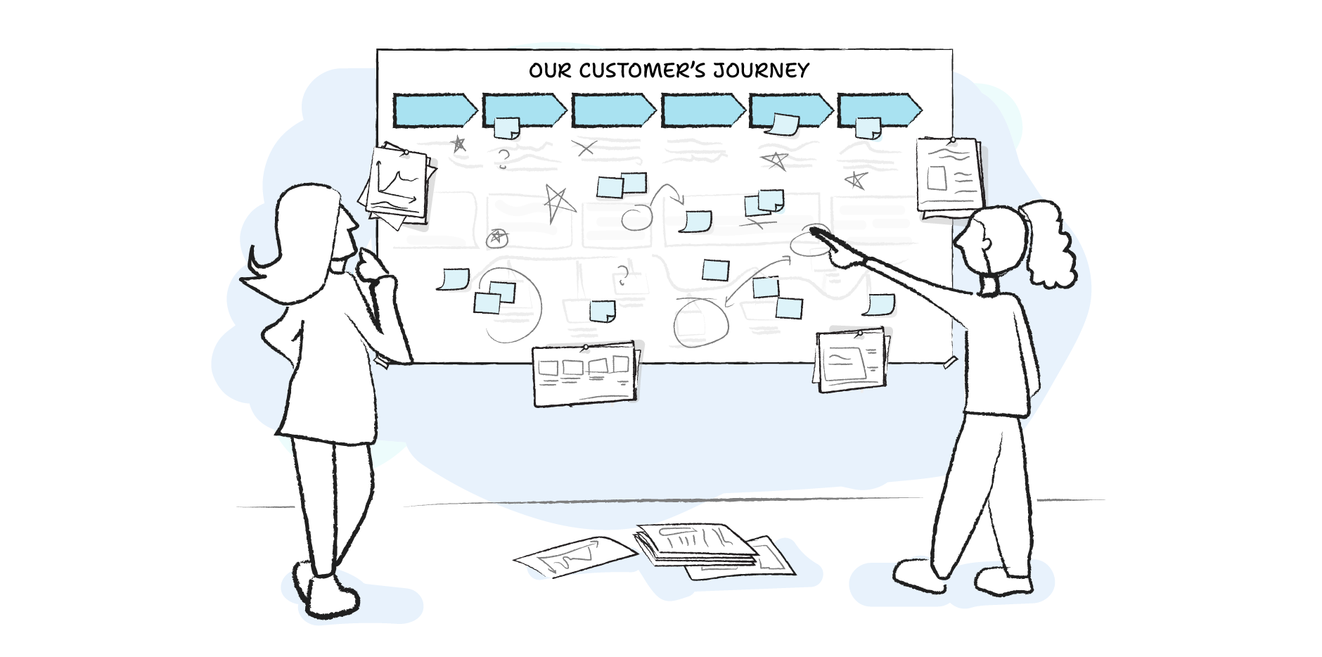
On journey mapping
Moving beyond customer-centricity theatre. An in-depth breakdown of journey maps and how to use them correctly.