In early 2024, the Food and Drug Administration (FDA) shared a draft of Key Information and Facilitating Understanding in Informed Consent — Guidance for Sponsors, Investigators, and Institutional Review Boards for public comment.
Formal guidance from the regulator is, by nature, abstract and general. However, when organizations develop informed consent forms (ICF) and supporting materials, the materials (and content within) must be tangible and specific. We pooled our life sciences expertise and experience designing educational and informed consent materials to share additional best practices in patient communication that may help comply with FDA guidance, as well as practical tips on how to apply them to your own work.

1. Develop informed consent materials with input from stakeholders who are or may become involved in the process
Informed consent is an on-going process, involving many stakeholders with similar, and sometimes, competing needs — considering their respective needs, expertise, perspectives, and consciously weighing where the tradeoffs are happening, is critical to improving and expediting clinical research and voluntary study participation.
For example:
IRB may be reviewing several studies, requiring use of standardized institutional templates with strict page count and formatting, to expedite review processes or printing requirements.
Study staff (e.g., individuals who maintain ICFs and/or obtain informed consent) may have specific framing, nuances, suggestions for FAQs, or requirements related to context-of-use (e.g., in-person discussion, reconsenting, etc.).
Potential participant needs will vary due to their background, setting, timing, prior experience or treatments, disease state, study goals, etc. Feedback and input from the potential participant pool is especially critical in cases where the study design aims to recruit individuals from historically under-represented groups.
- IRB requires use of a specific institutional template, which strips out blank margins around the ICF — this can decrease the effectiveness of a potential participant’s ability to scan, process, and internalize
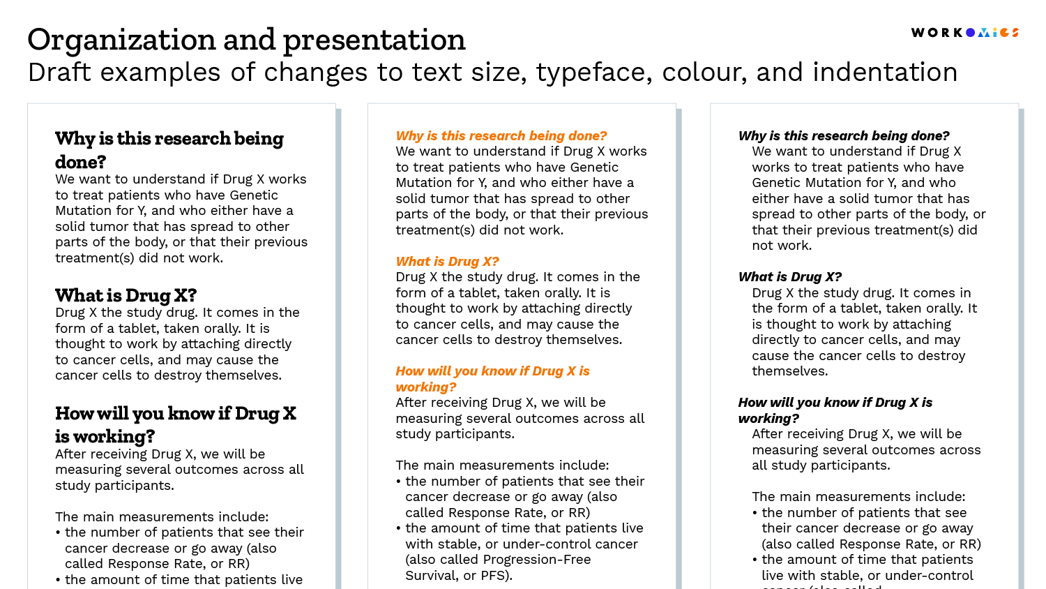
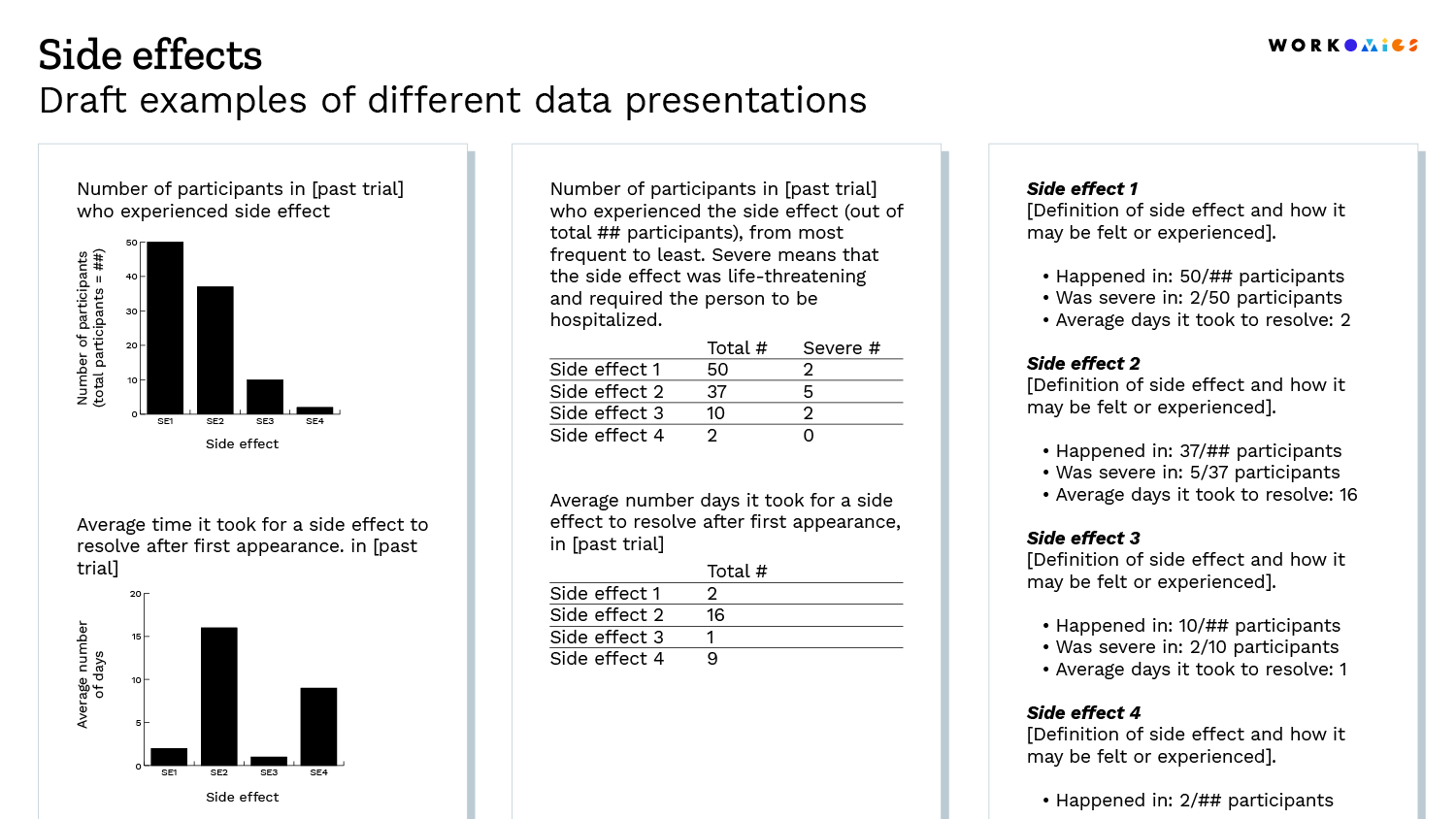
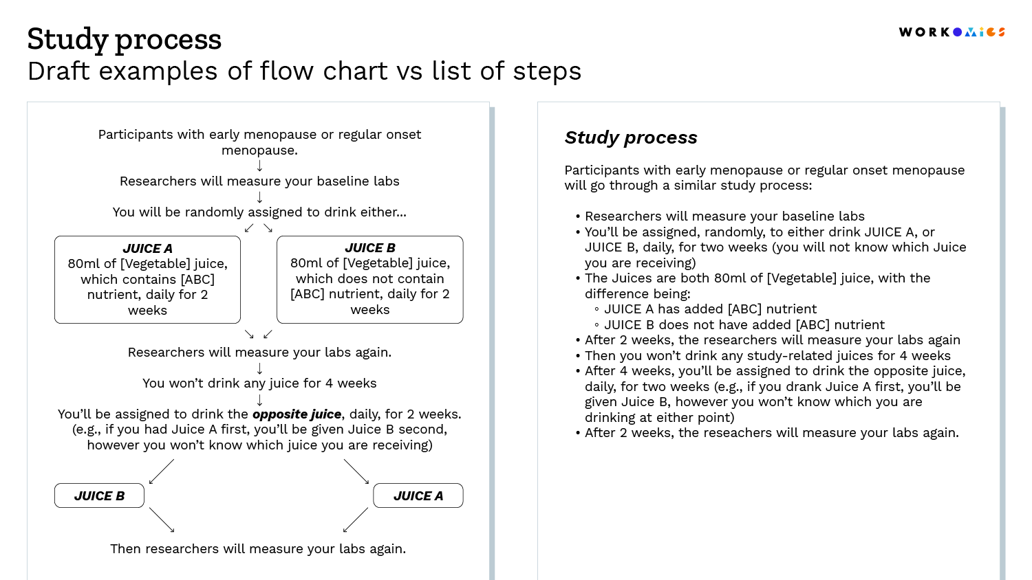
- Visuals can take up space (leading to expanded page counts), and may be challenging for site staff to create and maintain — this can lead to a tendency to remove visuals, even though pictures can improve comprehension.
- Colour coding may be a helpful communication tool, but a research site may not have a colour printer
Tips
There are a variety of methodologies for soliciting input: surveys, open-ended interviews, knowledge testing, validation sessions, etc. We often borrow methodologies used to collaboratively identify and design information architectures (IA), such as card sorting / tree testing.
2. Create and maintain a consistent information hierarchy based on the intended audience and their goals
A consistent information hierarchy will lead to a better experience — by reducing the time and mental load required to navigate, digest, and re-orient oneself to information. Is the content easy to follow and are related concepts grouped together? Or, are we taking our audience down a path that is turbulent? Every minute spent trying to parse content can be valuable time lost, or worse, lead to incorrect application and misunderstanding.
Tips
We suggest aligning your information hierarchy to at least one of the following organizing principles:
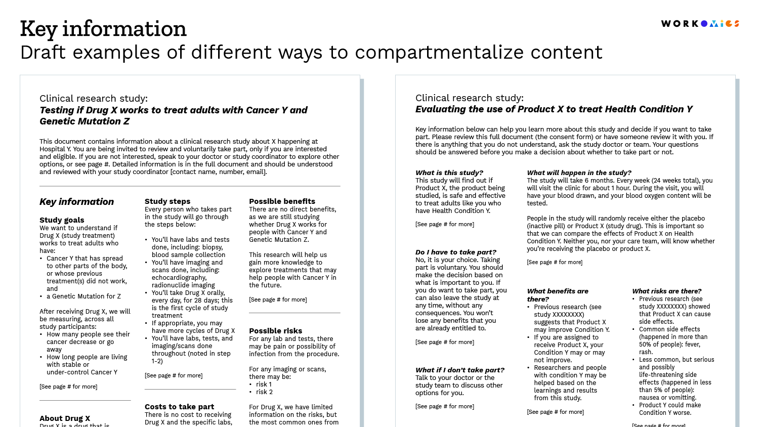
- Going from macro to micro: starting with a broad overview before going into granular detail
- Setting a foundation before application: the “what” before the “why,” followed by the “how”
- Ordering tasks chronologically: based on how the user would perform or encounter tasks
- Ordering information based on importance: key takeaways before nice-to-have information
3. Design for digital to increase opportunities for accessibility
Digital formats may offer flexibility for potential participants to navigate information in their preferred way, such as:
- use text-to-voice (screen reader)
- increase/decrease font size or zoom-in
- jump across sections or content
- expand or collapse information based on perceived relevance
- watch a video or listen to audio
- receive at-point-of-need definitions/pronunciations
- change the language (assuming accurate translations exist)
Furthermore, digital formats may also allow study staff to:
- track where and how long the average audience spends on specific sections
- receive questions directly on specific content/words that can be discussed in follow-up conversations/chat
- integrate knowledge testing, to see where there may be misunderstanding or follow-up explanations required
Tips
We suggest getting in touch with your IRB and IT teams to see what is feasible and understand the security, data, and maintenance requirements. To accommodate potential participants with limited or no technology access and literacy, always offer a physical copy.
4. Provide a wide range of examples that demonstrate there is more than one way to apply the guidance
For guidance users, it may be a large mental leap to move from words in the guidance, to action. It’s helpful to see multiple best-in-class examples that demonstrate different ways to execute the guidance — particularly when it is shared directly after the written recommendation (e.g., at point of need).
Tips
Writing and wording
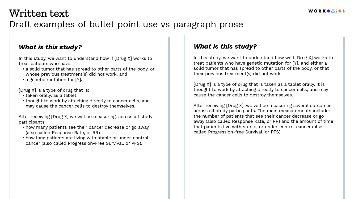
Build in plain language reviews in the development of your informed consent material. You should strive to use shorter sentences and words.
Some resources and examples of plain language:
- Centers for Disease Control and Prevention: Everyday Words for Public Health Communication
- gov: Guides and Resources
- gov: Resources
- Multi-Regional Clinical Trials: Clinical Research Glossary
- National Institute for Health: Clear Communications, example consent form templates, etc.
- Readability tools*: Flesch-Kincaid grade level, Gunning Fog Index, Coleman-Liau Index, SMOG index, Linsear Write readability formula, PRISM, (etc.)
Design, format, presentation
It is often easier to see than to tell, so we’ve shared a few draft examples below.
*There are limitations to only using readability/reading grade tools, as your sole benchmark for success.
Limitation example 1: Many tools will output a higher score if you have longer, multisyllabic words (e.g., chemotherapy, which is 5 syllables). This can be challenging to get around if your intentions are to (a) include a medical term in its most popular form, as a person may hear from a doctor, and (b) then define the medical term with plain language afterwards.
Limitation example 2: These tools do not account for the effects of visuals, design, and formatting, on supporting ease of reading, building knowledge, and information retention.
Our other ideas worth exploring
On journey mapping
Moving beyond customer-centricity theatre. An in-depth breakdown of journey maps and how to use them correctly.
Why building awareness for rare disease clinical trials matters
A framework that can help us better measure patient experience, and allow organizations to continually learn, grow, and implement changes both small and large to improve patients’ experiences.
Improving patient experience: a multidimensional measurement framework
A framework that can help us better measure patient experience, and allow organizations to continually learn, grow, and implement changes both small and large to improve patients’ experiences.

